Color Palette Picker
Choose your base color or upload a photo to start
You can adjust your base color by clicking directly on the color wheel.
Click a color to generate a scheme:
Color Themes
Free Color Palette Picker for Teachers & Art Students
Let our color theme generator help you explore color harmonies with ease.
What is this color generator tool?
Color is one of the most exciting — but also misunderstood — elements of art. Students know what colors they like, but knowing why certain colors work together is a different skill entirely. That’s where this free color palette picker comes in.
The color palette picker is a free browser-based tool with two modes: a photo-based palette extractor that pulls dominant colors from any uploaded image and a color theme generator that lets you pick a base color and instantly see every major color harmony built around it. No account. No downloads. No cost.
Whether you’re planning a studio project, teaching color theory or helping students understand why the colors in a painting work the way they do — this tool gives you something to look at and interact with.
What Can You Do with the Color Palette Picker?
Mode 1
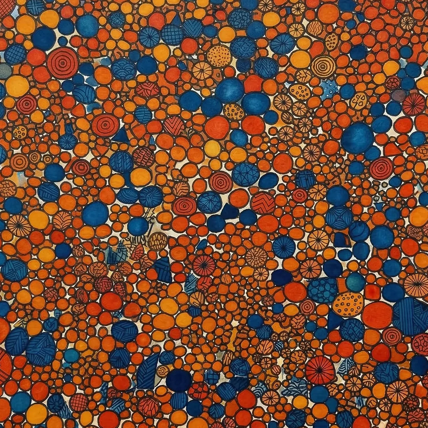
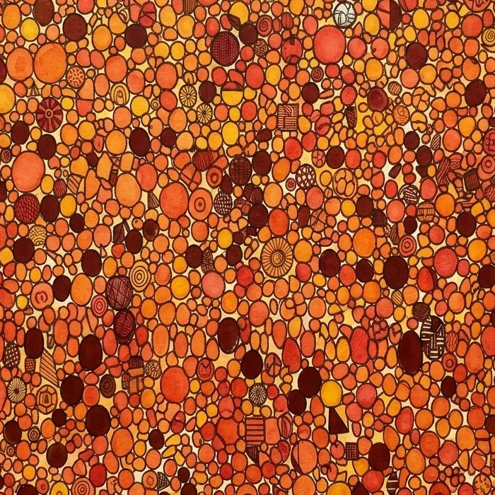
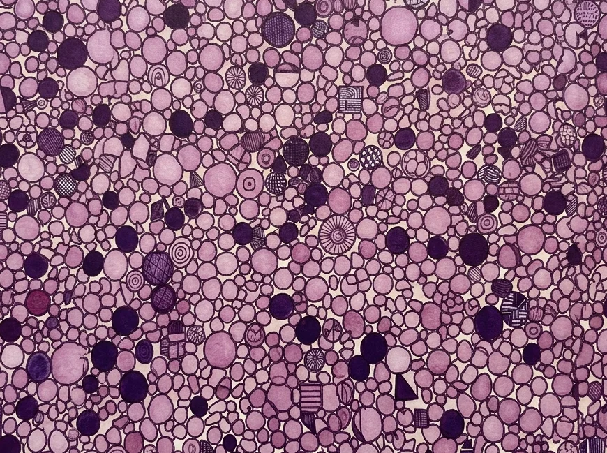
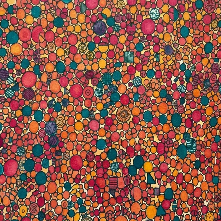
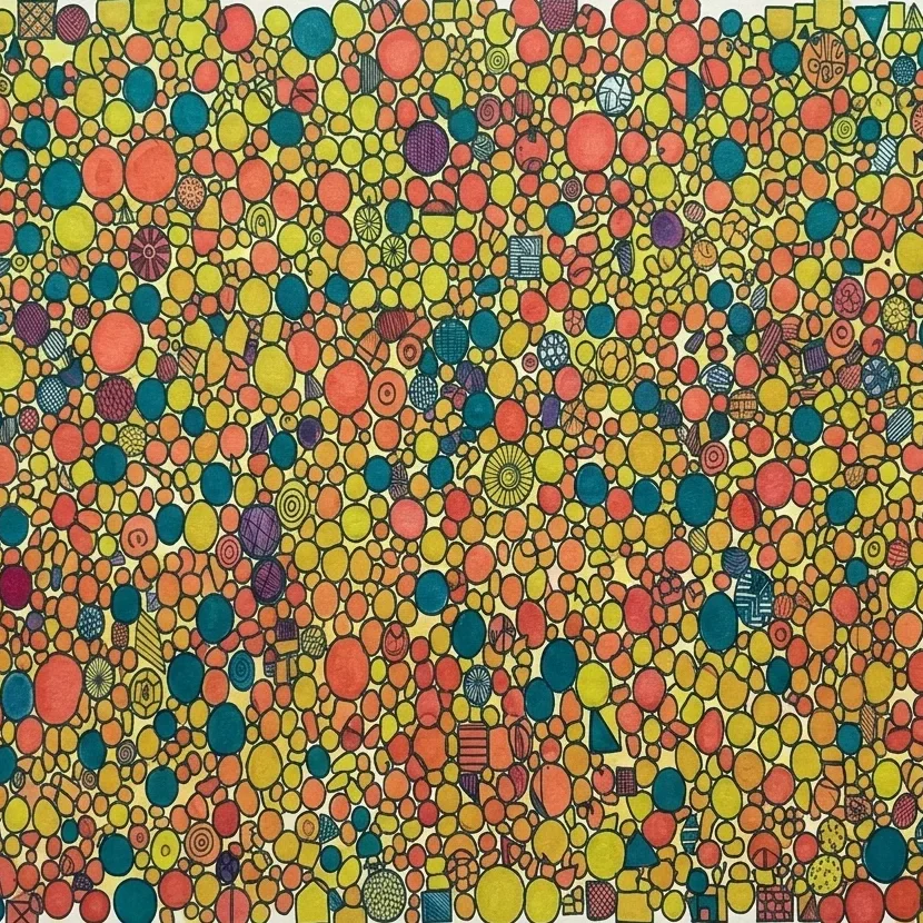
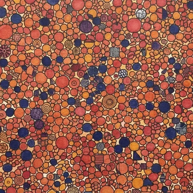
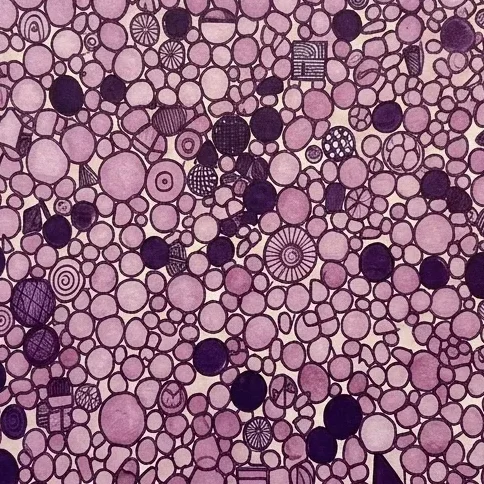
Extract a color palette from a photo
Image Upload
Upload any image — a painting, a photograph, a student artwork, a design reference — and the tool identifies the dominant colors and displays them as a set of swatches.
Color Analysis
Use this color match option to analyze the color choices in a master artwork, help students plan project palettes based on images they love or run a color analysis during a critique session.
Mode 2
Choose a color scheme from a base color
Choose a base color
Choose any base color using the interactive online color picker and HSL sliders, then let the tool do the rest of the work. It generates every major color harmony — complementary, analogous, triadic, split-complementary, tetradic, etc — based on your chosen color.
Interactive Color Wheel
Drag the points on the interactive color wheel and watch as your color harmony updates in real time. Use “Show All Schemes” to see everything at once or select just one specific color harmony to focus on.
Key Features
Enjoy our color theme generator for free. No account needed, no subscriptions. Our browser-based color picker works on Chromebooks, laptops, tablets and desktop computers.
Color Extraction
Upload any image and pull its dominant colors instantly.
Interactive Color Wheel
Drag point directly on the wheel to adjust and explore
Real-Time Harmony Updates
Every harmony adjusts as you move the color wheel points
HSL Sliders
Precise control over hue, saturation and lightness
Color Harmonies
Complementary, analogous, triadic, split-complementary and tetradic
Show All Color Schemes
View every harmony for your base color at once
Randomize
Generate a random starting color for open-ended exploration by clicking “Randomize”
Downloadable Swatches
Save palettes for projects or open in digital art software.
How to Use the Color Palette Picker in Your Art Classroom
Say goodbye to traditional color wheels & worksheets and say hello to our browser-based digital color picker. Wondering how your can use this tool in your own visual arts classroom? Take a look below for a few good ideas you can implement in your own classroom.
01
For Color Theory Lessons
Choose a base color that relates to your current unit and use “Show All Schemes” to display every harmony at once on your projector. Walk students through each harmony. visually — this is far more effective than a color wheel diagram in a textbook.
02
For Studio Project Planning
Before students begin a new project, have them find a reference image with the color mood they want to achieve, upload it to the palette extractor and use the extracted swatch as a guide for their own color mixing or digital palette setup.
03
For Art Analysis
Upload a reproduction of a painting you’re studying and extract its palette. Ask students: what harmony is this artist using? Is the palette warm or cool? Saturated or muted? What effect do those choices have on the mood of the work?
04
For Digital Art Projects
After generating a color scheme in the color palette picker, students can download their swatches and open them in SimplDraw or another digital drawing tool to set up a custom working palette before they start
About Color Harmonies
Want to know know more about color science and color harmonies? Take a look at these videos!
An overview of color theory basics for digital painters. Includes the difference in digital colors.
A Brief History of the Color Wheel
Every color palette picker, color scheme generator and color theory class in existence traces its roots back to one person: Sir Isaac Newton. In 1666, Newton was experimenting with light in a darkened room at Cambridge Universtiy. He directed a narrow beam of sunlight through a glass prism and observed something no one had documented before: white light separated into a band of distinct colors (red, orange, yellow, green, blue, indigo and violet). Today, we know those seven distinct colors that Newton saw as the acronym ROY G BIV. These colors form the visible spectrum of light.
Later, Newton arranged that spectrum on colors into a circle, connecting the red end to the violet end — and published the first color wheel in his book Opticks in 1704. This color wheel became the first visual tool for understanding how colors relate to each other and laid the foundation for every color harmony rule that artists and designers have used for centuries. For a deeper look at how Newton’s work shaped the modern color wheel, the Munsell Color Company’s overview is an easy read.
About 150 years after Newton, the German poet and scientist Johann Wolfgang von Goethe created his own color wheel with a different emphasis — he was less interested in the physics of light and more interested in how color is experienced emotionally and psychologically. His 1810 color wheel introduced the idea that colors carry feelings: warm colors advance, cool colors recede, certain combinations feel energetic while others feel calm. These ideas still show up in every art classroom discussion of color mood and temperature.
Color Harmonies: A Reference Guide
A color harmony is a combination of colors that follow a specific geometric relationship on the color wheel. These aren’t arbitrary rules — they’re patterns that create predictable visual effects, which is why artists and designers have used them for centuries. Our color palette picker builds all of these automatically from any base color that you choose. For a deeper dive into color harmonies with visual examples, check out the Student Art Guide’s color theory lessons.
Complementary
Two colors directly opposite each other on the color wheel — like red and green or blue and orange. Complementary pairs create maximum contrast and high visual energy. Use them when you want something to stand out or feel dynamic. The downside: complementary schemes can be overwhelming if both colors are used at full saturation across a large area.
Analogous
Three or more colors that sit next to each other on the color wheel — like yellow, yellow-orange and orange. Analogous palettes feel cohesive, harmonious & natural. They are common in landscapes & nature photography because the natural world tends to shift gradually between hues. Students who want a calm, unified feeling in their work often do well using an analogous scheme.
Triadic
Triadic color themes happen when three colors are evenly spaced around the color wheel — like the primary colors red, yellow and blue, or the secondary colors orange, green and violet. Triadic color harmonies are vibrant and balanced, but harder to manage than analogous ones. The key is letting one color dominate and using the other two colors as accents.
Split-Complementary
Split-complementary color schemes are a variation of the complementary color scheme: instead of using a color and its direct opposite, you use a color and the two colors on either side of its complement. This gives you contrast without the full tension of a complementary pair — a good middle ground for students who want visual interest without the clash.
Tetradic
Tetradic color harmonies occur when four colors are arranged as two complementary pairs — also called a double-complementary color scheme. Tetradic palettes are rich and complex, but require careful balance. They work best when one color is clearly dominant and the other colors play supporting roles as accent colors only.
Monochromatic
Monochromatic color schemes occur when a single hue is used, along with all of its tints, tones and shades. tints, tones and shades are made by adding white, gray and black to the base color respectively. A monochromatic color theme feels inherently unified because every color in it shares the same root hue, making it one of the easiest schemes to pull off successfully.
Frequently asked questions
Looking for answers about our color palette picker? Browse these FAQ’s! If you still can’t find the answers you need, please contact us directly.
Color Palette Picker FAQs
Is the color palette picker free to use?
Yes! Our color scheme generator is completely free — no account needed, no subscriptions, no logins, no hidden costs.
What is a color palette picker?
A color palette picker (aka color theme generator) takes a single base color and automatically produces multiple color schemes based on color harmony rules — complementary, analogous, triadic and others. The ATT color palette picker does this interactively, updating in real time as you adjust your base color on the color wheel.
Can I use it as an online color picker for a specific image?
Yes. The photo upload mode extracts the dominant colors from any image you upload and displays them as a palette. It functions as both a color palette picker and an image-based color generator.
Can students download the color swatches?
Yes. Every generated palette can be downloaded as a swatch file for saving, sharing or opening in digital art software.
Does this color scheme generator work on Chromebooks?
Yes. The tool runs in any modern browser with no downloads or account required.
How is this different from tools like Coolors or Adobe Color?
Both Coolors and Adobe Color are excellent tools built primarily for graphic designers and brand work. The ATT Color Palette Picker was built for art classrooms — it’s simpler, requires no account, works on school Chromebooks and pairs directly with the art education content of artteachertools.com. If you want to explore a more advanced free color harmony calculator alongside this tool, Sessions College’s Color Calculator is also worth bookmarking — it’s free and education-focused.